Thank you for visiting my blog!! I have moved over to www.tiastoutphoto.com so head over that way to see more awesome photos and behind the scenes!

Monday, October 21, 2013

DIY photo backdrop for $3

I've had a few people ask about the backdrop that I made for some pictures that I took. Here is the tutorial.

First find 3 (or more if you wish) colored tablecloths from the dollar store. (or walmart).
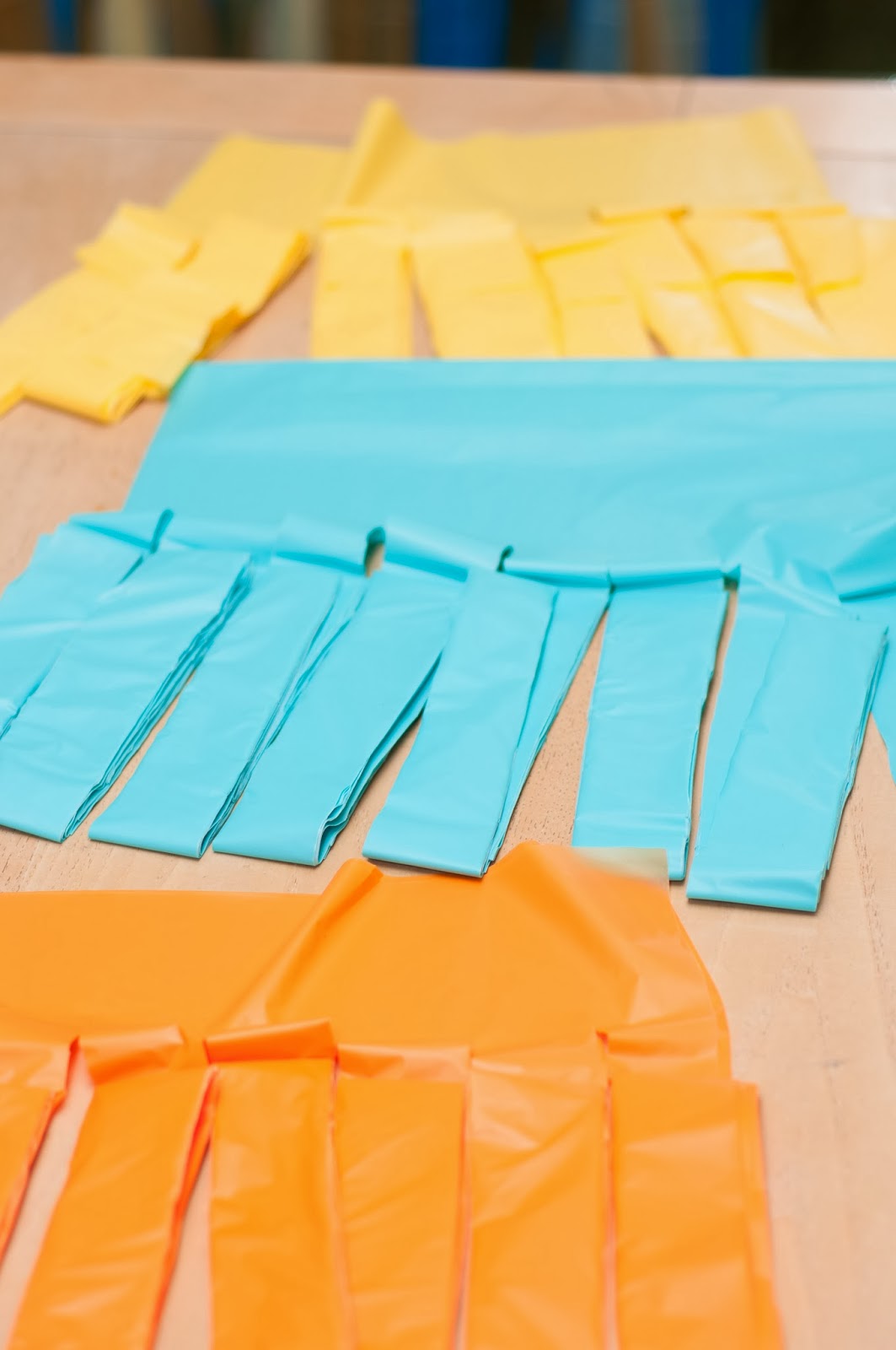
Don't unfold them all the way! We want to make sure that we leave only 4 layers at the top. You might have to fold some of it over so you can cut it.


 Next we're going to cut it into strips. You can do however many you want. I did 8 strips (with it folded) but I also think that 6 would be good too and give you a bigger, fuller look.


 After cutting all your tablecloths the same way you need to hang them up. Not too high because you'll need to reach the top and if you do it too high your arms WILL get tired.
(sorry if this picture throws you off a little bit but it's a mirror we are trying to hide with the backdrop)


Layer your tablecloths over each other.
You will have some (I had 3) streams that are double. You will need to cut these because when you cut your tablecloths originally they were folded over. You will be able to tell these apart from the others because they will be thicker. Just slide your scissors right up the crease.


 Next start loosly braiding your strands. This is just a super quick loose braid. Then tie a not at the end. If someone is helping you and starting at the other end, I suggest leaving your not super loose then after going through and tightening them so they are at the same level.


Once you've got all that done, hang it up and fluff/tweak the streams to however you want them.  We ended up putting a white tablecloth behind ours just to block our mirror entirely. Hope this isn't too confusing and you have a great turnout on your backdrops!


The color combinations are endless! Leave a link to your backdrop so we can share color combos!


Tuesday, October 15, 2013

Southern Utah Maternity Photographer

I LOOOVVEEDD this session! Even though it was so windy, they pictures turned out so cute!


Monday, October 7, 2013

Did You Know?.........color schemes for pictures

This series of Did you know? is going to focus on color. I LOVE color! Black and white pictures can be beautiful but color can really make an image POP!
When we get pictures taken, I sometimes stress about outfits. I want us to look just right! But sometimes, I  really can't afford to go out and buy ALL of us new outfits. This article might help you in picking out clothes that coordinate from everyone's existing wardrobe.

Firstly let's start with the Primary colors:
Red, Yellow, and Blue.

Now we should know from our time in Elementary school that when we combine these colors, we can get tons of different colors. So let me introduce the color wheel.


Every color on this wheel was born from the primary colors. When we combine 2 primary colors, a secondary color is made. When we combine a secondary color with a primary color, a tertiary color is made.
And the right side of the wheel is classified as "warm" and the left side as "cool".

Now on to color combos.

1. Monochromatic
This is using variations of a single hue. So if we take Blue and have everyone wear a different kind of blue, this would be Monochromatic. This type of harmony feels clean and elegant. You can switch it up by adding tints (hues created by adding white), shades (hues created by adding black), and tones (hues created by adding Grey).
So in the image below, I have taken blue and added white making a blue tint(the top part), and added grey making a blue tone(the middle part), and added black making a blue shade(the bottom part).
 

2. Analogous
 An Analogous harmony uses colors that are adjacent to each other on the color wheel, a tertiary.


3. Complimentary
A complimentary harmony is when you pair two colors that are opposite each other on the color wheel. This harmony adds vibrancy to photos. De-saturating one of the colors can really cause the other to "pop". Using tints, shades and tones will keep this scheme from being "trite" such as a Christmas Red and Green combo. So add some interest and diversity with shades, tints, and tones!

4. Split Complimentary Triad
This is variation on the complimentary scheme. This uses a color, then takes two colors adjacent to it's complimentary.


5. Tetradic
This harmony takes 4 colors that are complimentary pairs.


There you have it! A lesson on colors that can help you pick outfits from the wardrobe you already have! Now mind you that you can deviate from all of these harmonies using shades, tints, and tones. They can add a depth or a brightness. Now go out and experiment with your wardrobe!

info for this Did you Know? was gleaned from Cardigan Empire


Tuesday, October 1, 2013

Southern Utah Child Portrait

I love this Kid! This was a fun shoot. We went out behind our house and found this group of trees. Would you believe this was shot at 11:00 in the morning? LOVE IT!


Add caption